How Likely Is ‘Likely’?
This week’s data is from a survey about common probability phrases, in which people chose the most likely between pairs of words or phrases and assigned a probability to each word/phrase in the list. Some demographic data was included, including education background, English-speaking background (whether native and/or fluent), and age bracket.
I was curious whether I could find any patterns related to native speaking/fluency, but at least in the exploration I did, nothing notable was coming out. What I did find was a more consistent spread correlating to age. This is most clearly demonstrated by pulling out just the youngest and oldest cohorts and lining them up:
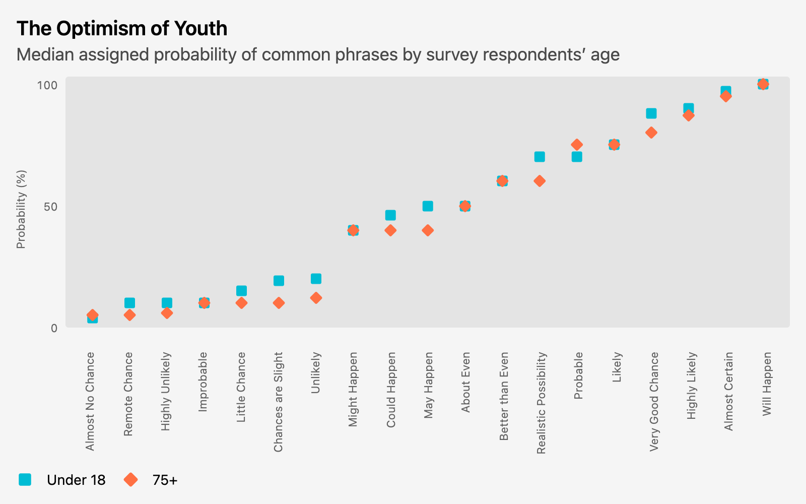
The other thing that jumped out at me was this:
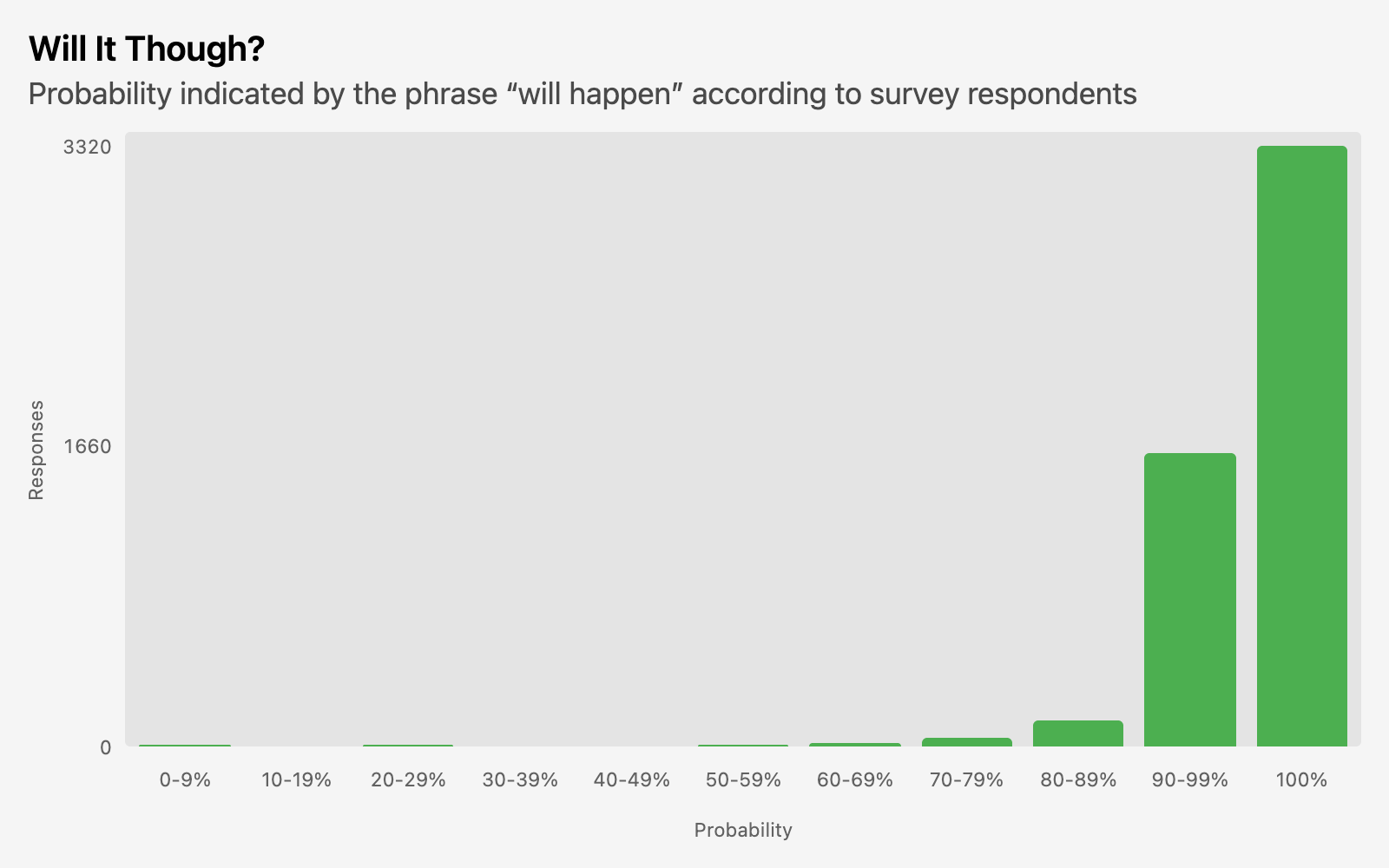
Do you see it?
It’s not that 100% is the most-picked value for “will happen.”
It’s how many people said something else.
A third of respondents chose something in the 90s, and there is a nonzero number of responses in every bucket except the 30s. I did wonder whether there was any correlation to English-speaking background or country of residence on this one in particular, but I couldn’t find a significant difference in breakdown across those categories. I guess some people just have a different definition of “will”.
The Queries
Here’s my code for the first chart. It’s just a pivot after joining and selecting the columns I wanted:
with probabilities as (
     select term,
            probability,
            age_band

       from respondent_metadata
       join absolute_judgements
      using (response_id)
      where age_band in ('Under 18', '75+')
)

      pivot probabilities
         on age_band
      using median(probability)
   order by "75+", "Under 18"
The order by at the end just sorted the x-axis so that both series keep a consistent up-and-to-the-left trajectory.
For the histogram, I manually grouped my buckets, creating a range_start column in the first CTE that I removed from the final select statement, used twice in the probability_range derivation and for sorting the final results.
with probabilities as (
     select term,
            divide(probability, 10) * 10 as range_start, -- Round down to the nearest 10
            case when probability = 100 then '100%'
                 else range_start || '-' || range_start + 9 || '%'
                  end as probability_range

       from absolute_judgements
),

pivoted as (
      pivot probabilities
         on term
      using count(*)
   order by range_start
)

select probability_range, "Will Happen" from pivoted
I had a version of this without the pivot—which I’d done first as a way to see this across all the terms. When I’d narrowed down what I was going to use in this post to just “Will Happen”, I’d updated this to just use select and where. But then I noticed that 30-39% was missing from the chart, since there were no rows left with that value for probability_range. So going back to the pivot meant that range was included from other terms that had values there.
An earlier version of the query also had probability // 10 * 10 as range_start. This gives the same results. Apparently the syntax highlighter I use on this site treats // as a comment (even for SQL), so everything after that was in gray italics. While // is comment syntax in a lot of languages, I don’t know of any SQL dialect that uses that. I can’t rule it out, but I’ve always used --.
Anyway, In DuckDB at least, // and divide both do an integer division—so dividing and then multiplying by 10 effectively rounds down to the nearest ten. In, say, Snowflake, I could’ve gotten this with floor(probability, -1), where -1 is a negative number of decimal places. DuckDB’s floor doesn’t have a second argument for some reason; it always rounds to the ones’ place.